
This is an education project for a fictional producer of straw widgets.
This assignment went fairly well. Text is something I can relate to easily. It was interesting to learn the different tags to manipulate the text. I had been exposed to most of it before, but I hadn't heard of keywords. I also found the default fonts list to be very useful. Text is easier to style with the prompts from NetBeans.
This week I spent 10 hours in deliberate practice and 7 hours reading. I tried to do the assignments in the Teaching and Learning section. I also spent time on the discussion boards. I did what I could with the CSS Background Images assignment. I didn't find the code to the examples so I just worked with my own images. I realize that I have a lot of work left to do and only a short time left to complete it.
For this lesson, I worked on the links on my site. The home page will show the results. First, I changed my main menu links to a horizontal display. I also styled the 5 states of a link: link, visited, focus, hover, and active. I used the Netscape colors because they are familiar and because they have good contrast for accessibility. I changed my link underlines to box bottoms so they would be thinner and below the descenders. I also styled the box bottom underlines so they would have greater accessibility. I chose not to use sprites to add icons at this time.
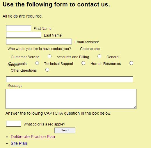
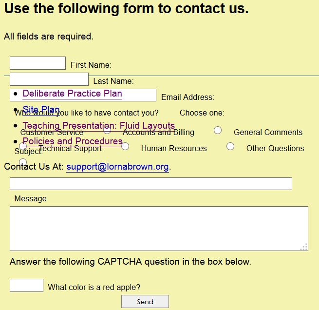
I spent hours trying to style my Contact Form with CSS. I created a special stylesheet because of the amount of things that needed styling. I tried to use the example in the course. But it used a different format for creating their form. I worked for hours to modify the instructions in the examples. But as you can see by the images below, it wasn't working out at all. It was out of alignment before, but it looked a whole lot better. I decided that I needed some help before I beat my head on a brick wall any further.
I did get a lot of experience working with align, float, clear, margin, etc. So it wasn't a loss. I also learned to add radio buttons. Though, as you can see, they were added to the alignment problem. NetBeans added a lot of red dots when I tried to follow the instructions in the "Form Design, Layout, and Presentation with CSS" instructions.

Screenshot of my Contact Form in Chrome.

Very sad-looking screenshot of my Contact Form in Firefox.